
Getting Started With CodeStitch
Stitch Buttons Explained
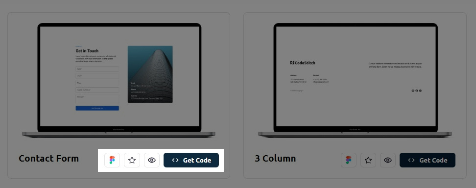
We provide some added functionality on our Stitch display cards to give you everything you need when choosing your Stitches:
-

- Figma Link: Click this button to get access to the Figma file that has all the designs for each Stitch from mobile to desktop.
-

- Add to favorites: Clicking this will open a modal to add it to your favorite Stitches folder. It will ask you to choose a folder to add it to, or create a new one and save.
-

- Preview Stitch: When you click this it will open the Stitch up in a separate tab to view the whole thing yourself live in the browser and interact with it to make sure it's the right Stitch for you.
-
- Get Code: When you're ready to get your code, click this button to open the code box to copy and paste the code into your project. You can choose between regular CSS, LESS, or SCSS options.
Finding the perfect Stitch
First, there's no such thing as the perfect Stitch! There are an infinite amount of designs and styles that designers and developers use for their sites. It would be impossible to cater to all of them and our entire library would feel very messy and inconsistent. So what we do is provide a uniform product with consistent design patterns and fonts so you can grab the design you need where we did 95% of the work for you and you do the extra 5% to get it perfect for your project. The consistency in our design patterns make our code more predictable, which makes it easier to edit because it's the same code you've seen in every other Stitch with the same organization.
After using CodeStitch for some time, you should be pretty comfortable with reading our code and knowing where everything is and what they do. This is the secret sauce in our product - it's consistent and you don't need to learn a framework to use it. Anyone with some CSS knowledge should be able to figure out how our code works and make changes regardless of skill level.
Adding a Stitch
When you click the "Get Code" button, a new page will load that has our code box to get everything you need:
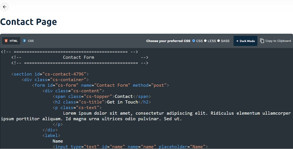
This is where you get the code for each Stitch. We provide all the files you need to make it work. Most of our Stitches will only have HTML and CSS, while some more interactive Stitches will have some Javascript to make them do some special interactions, such as FAQ drop downs or navigations.
Copy code
To copy the code, you can either select all the code in the box, or use the "Copy to Clipboard" button in the upper right corner of the box to do it for you.
Dark Mode button
Click this button to add dark mode styles to your Stitch's CSS that will activate when you toggle on dark mode from the dark mode system we provide. Click this link to learn more about adding dark mode to your website.
What to do with variables and fonts
In every Stitch we added a :root selector to add variables for you to easily replace and make quick changes to the style of it. After you add a Stitch, you should move this over to your global CSS stylesheet that is shared on all pages and remove it from the Stitch. It's not meant to stay there. It's there for you to extract to make editing much easier.
All our variables have the same exact names across all of CodeStitch. That way, when you grab multiple Stitches from the library and stack them in your website or make an entire website, you only need to pull out all the variables once and add them to your global stylesheet. When you paste a new Stitch into your project you just remove the :root variables from them. They will pull from the global stylesheet. Below are the variables we use for CodeStitch:
We have a primary color which is the main brand color, then we have a lighter version of that color for accessibility purposes if needed, a secondary color and light version, body text color, and white body text color. Together these comprise most of the styling variables you need.
Once you grab the variables, you don't need to do it again. Just remove the variables from each new Stitch you add and their styles will pull the values for --primary and so on from your global CSS file. Now, when you grab any Stitches from our library, they will automatically conform to the variables you set for the whole website in your global CSS file, no need to make any changes. They just work!
Remove the font-family from each Stitch!
We know not everyone will be using the same fonts, so we only use 1 font for all our Stitches and leave you to change the fonts to what you need. That's why all our Stitches are done in Roboto. It's not a stylistic choice, it's a functional choice to allow it to be more flexible and allow you to stack multiple Stitches on top of each other and they all have the same font and look uniform. However, the easiest way to do this is to just add a font-family to each Stitch in the mobile media query rather than making you download the font to use when chances are you're changing it anyway. You just have to remove it and all the headings, text, and links will inherit the fonts from your sites' CSS. If you are starting a new project from scratch using CodeStitch, here's how you add and locally host fonts on your website.
Remove the .cs-topper, .cs-title, .cs-text, and .cs-button-solid and place in your global stylesheet
These three elements all have identical styles across every Stitch in the library. You can copy and paste them and place them in your global stylesheet right under your variables. We did this so you can quickly edit these elements in one spot and they change on every Stitch in your site at once. The .cs-content div we wrapped around them dictates their text alignment and positioning. You only need to remove them in the mobile media query. Here's what they look like:
Directly under the .cs-text you may see what we call "overrides". They are section specific styles for the topper, title, and text. We left a comment to explain why they're there as well in the code. Here's what the most common one will look like:
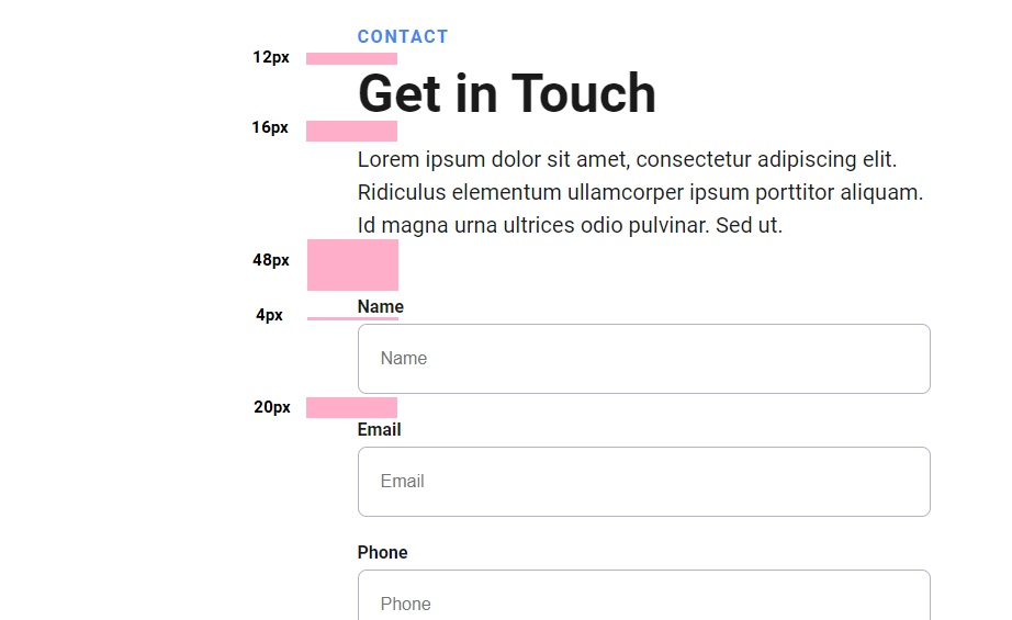
This particular override is a common one we use when we have a side by side section. This is creating the spacing rules for the text when you have multiple paragraphs and a call to action button under that. It says every .cs-text element will have a margin bottom of 16px (1rem), and the last element type will instead have a margin bottom of 32px (2rem) to separate it from the button below it. Regular default .cs-text styling has no margin on it. But this override adds the margins for that particular section.
We know it may seem redundant to have the .cs-text default styles and below it have another .cs-text declaration, but it's done with a very specific purpose. In the beginning we had the topper, title, and text all styled uniquely for each section. Sometimes they had different text alignment, some had a white color for the text because it was on a dark background, etc. When we stitched them together we had a hard time pulling out the important default styles to place in our global stylesheet and we spent a lot of time just fixing them so they're uniform. We knew there was a better way. So we made every single topper, title, and text declaration identical and added overrides that were section specific. We could remove the topper, title, and text template styles from every Stitch we add and let the overrides make the section specific design tweaks to them.
This allows us to not repeat ourselves in our code. If the topper, title, and text elements all have the same base styles, we should be extracting those styles out of the page CSS and put them in the global stylesheet to be accessible on all pages at once.
This is essentially how a framework functions - it's a set of predefined classes shared on all pages for you to reuse to make styling more consistent and faster. We're just making our own little mini "framework" for our predefined text styles and variables.
The cs-button can be removed as well and placed in your global stylesheet. They also inherit their alignment from the .cs-content div it is wrapped in.
Once you get used to pasting and removing the default variables and styles, it's a pretty smooth process and the results are much better than if we didn't do things this way. We wanted to make our code without external frameworks but still have the consistency of styling they bring. These are our work-arounds to make the code uniform, consistent, clean, and easy to edit. We use CodeStitch everyday ourselves for our own clients and after over a year of testing and practical use we came up with this system to improve and simplify the workflow.
Making Edits
Editing Stitches is very easy and straightforward. Almost all of the styles, font-sizes, margins, widths, etc. are all set in the mobile media query. This was a huge priority when building them because we don't want you to have to search all the media queries to make changes and go up and down to change different values in different spots. In our Stitches, they will all be in one spot, and if they change in a later breakpoint, it's noted in a comment above the property that changes so you know where to find it and that it will change for larger screens.
We use flexboxes for all our arrangements starting with a column (vertical) orientation on mobile and the later tablet and desktop breakpoints are mostly used to rearrange the flexboxes for horizontal orientation. 95% of the time all the styles you need for making edits are going to be in the mobile media query and the latter media queries are used for positioning and flexbox arrangements.
You'll also notice a pattern in our CSS. In every selector for every element in CodeStitch, we have a certain order for CSS properties to make editing easier. here's the order in which we write our styles:
- Font Styles
- Width
- Height
- Margin
- Padding
- Decorative Styles
- Display Type
- Positioning
- Transforms
- Transitions
Here's an example of this structure from one of our Stitches:
Notice how the order resets inside the :before selector. This order was done very purposefully and deliberately to make editing a Stitch much easier. Once you get familiar with the order, it's MUCH easier to edit the Stitches because you know exactly where to look for which styles for any given element. This is just another example of the level of care and detail we put into our code.
Deciding website layout
When making a new website, it's often difficult to know what kind of content and sections you need and where they should go. Let's help you with that!
In our experience freelancing with small businesses for years, we've identified the optimal website layout for the best design and conversion rates. Here's the general template we use to design all our sites for our freelance clients over the years:
- Hero
- Main Services (3-4)
- About
- Misc. Content, side by sides of other service highlights they want to rank for or keywords, content heavy sections, etc. This is meant to rank of Google where content is king
- Gallery
- Meet The Team (if needed)
- Stats (if needed)
- Why Choose Us
- Competitor Comparison (if needed)
- Reviews
- Final call to action section to contact them
- Footer
This is the general order that we use to base every design on and there's a reason: Studies show that people mostly remember the first and last parts of a website. So we put the main big ticket services at the top and only 3-4 of them, then we put the reviews at the bottom. That way, when they leave the site they remember what they do, and all the nice things people said about them. If they're just shopping around, when they leave the site they do so with a positive experience and hopefully come back when they made their decision on whether or not to hire them. The miscellaneous content for ranking is in the middle. We need lots of good and engaging content to rank for our keywords on Google, but sometimes it's hard to find places for it.
We put that stuff in the middle because it's not important for the visitor to remember in order to make a decision on whether to go with your client's services. It's there to be ranked because the client won't remember it anyway. The middle of your site is a weak spot, and we turn it into an advantage.
These sections are the base sections in the CodeStitch library and you'll notice they are placed in the order in which they are best placed on a website from the list mentioned above:
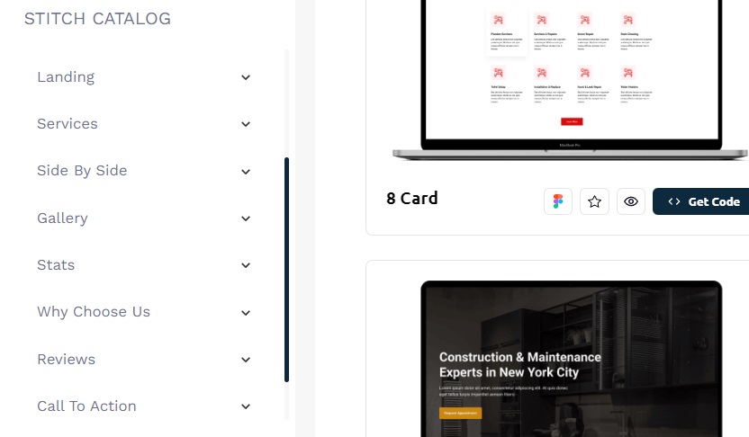
CodeStitch was designed this way on purpose to make building a website for a client easier, faster, and more intuitive. If you're starting from scratch and using CodeStitch to build the whole thing, you can browse our library section by section in the order they should be placed in your site, taking out the guess work on how to structure your website and what content you need and where it goes.
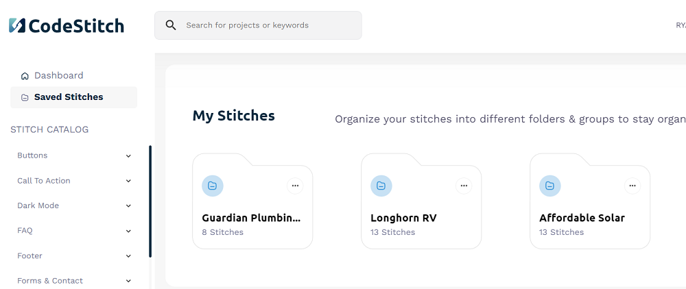
Using Saved Stitches folder
When you save a Stitch, it goes to your Saved Stitches page where you have all your folders that you created. When you are creating a new website for a client, you can add the Stitches you like to a saved folder so you don't have to go find them individually.
You can also use the folder to save all the Stitches you like that fit a certain industry so you can quickly scan your folders for Stitches that fit a client. This will help you start new projects faster since you don't have to go find every individual Stitch again - they're all right there for you to access together.
In this example, we saved all the Stitches we wanted to use for a client, and we used 8 Stitches.
When you click on your folder you can see all the Stitches you added in the order you added them and you can click to copy their code directly from your folder:
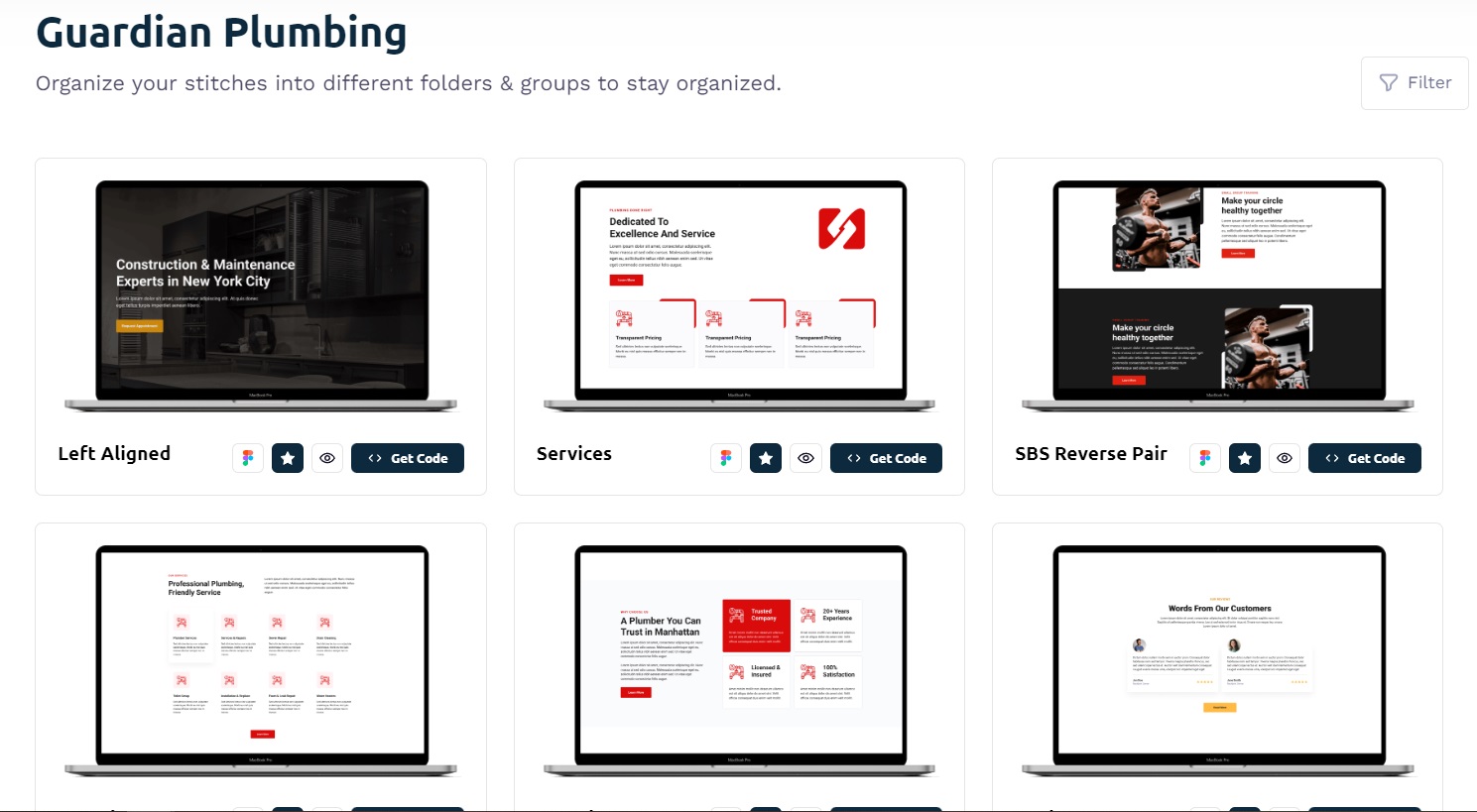
You'll notice that there's different color buttons and images, that's not a problem, they don't have to be. We will change those values after we add a Stitch
Using our Figma files
When you upgrade to Pro, every Stitch will have a Figma button for you to click and open up the Figma file for the whole section from mobile to desktop. It's a view-only file, so to be able to use it and make edits, you need to highlight the section frame, copy it, and then paste it into your figma project file where you can edit it.
You can use the Figma files for every Stitch to also "stitch" together a Figma design to do a design presentation with your client and get the design approved or edit it based on their feedback. Then you can go back and grab the Stitches from your presentation, paste them all into your project, and make any edits they requested in the design presentation.
Another good practice is saving a Stitch to a project folder after you grabbed the Figma for your presentation. After you put together the presentation and the client approves, you can go back to your Saved Stitches and easily grab the ones that were part of your presentation and throw it together real quick and make any changes or edits you need to make.
Building an entire website with CodeStitch
In this video we will go over how you can build a whole website with CodeStitch:
CodeStitch Navigations
Our navigations are built to be simple, with no animation libraries or frameworks and easy to edit.
We split up the mobile and desktop CSS into separate media queries with mobile having a max-width breakpoint and desktop having a min-width. We keep all the styles for mobile inside mobile at a max width of 1023px and after that those styles don't get loaded. Instead, at 1024px wide, the desktop CSS is loaded and takes over. We do this so that any changes you make in mobile will not affect desktop at all, preventing you from wasting time to adjust your desktop styles for the changes made in mobile. This separation of the CSS styling is crucial to make the navs easier to edit and troubleshoot.
Mobile navigation options
Every navigation in CodeStitch comes with 3 mobile navigation options:
- Top Dropdown
- Slide From Right
- Full Screen
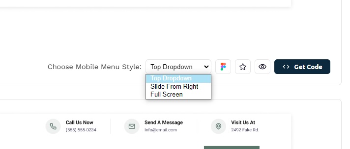
These are the animations that will play out when you open the mobile menu. We wanted to add variety to your navigations, so we built in 3 different mobile navigation animations to suit your needs for the project you're working on.
Adding Dark Mode to your navigations
At the bottom of the HTML for every CodeStitch navigation is a commented out dark mode button. This button was placed there with purpose. When you click the button in the "Get Code" box to add dark mode styles to your navigation, it will also come with the styles for that dark mode button that are specific to that navigation. Every navigation is unique, and a dark mode button can't fit universally inside all of them. So we placed a dark mode button in each navigation with styles specifically for that navigation's dark mode button to fit inside of it. Each button's position is different for each nav style. After you paste the CSS for the navigation with dark mode, uncomment out the dark mode button and it will just work!
To make the button work, all you have to do is grab the javascript code from the Dark Mode section in CodeStitch at the very bottom of the Section navigation.
Dropdown Navigations
Every navigation on CodeStitch will have a duplicate Stitch, except that one will have the code for a dropdown menu. That way you don't have to choose between which navigation to use based on which one has a dropdown menu. They all do!
Our dropdown navigation styles are also not part of the mobile or desktop media queries. Instead, they have their own:
This is again done so it's easier to edit and troubleshoot problems. By removing the dropdown code from the mobile and desktop media queries, we can eliminate the amount of scrolling you have to do to find the code to make the edits to them. You don't have to scroll up and down the mobile CSS to find your dropdown code to edit and then have to scroll down desktop to find it there. We pulled it out so it's much more organized and easier to use. Afterall, we build our Stitches knowing they will be edited and changed to fit a project's unique design styles. This helps us enable that ability for developers and save time making edits.
Our dropdowns are also very flexible. If you want to make another nav link into a dropdown, follow the instructions in the comment in the HTML for the navigation to copy and paste that list item over the list item you want to be a dropdown. Here's what it says:
"Copy and paste this cs-dropdown list item and replace any .cs-li with this cs-dropdown group to make a new dropdown and it will work"
That's all you have to do! We set the CSS styles and JavaScript event listeners to work on every instance of that .cs-dropdown class.
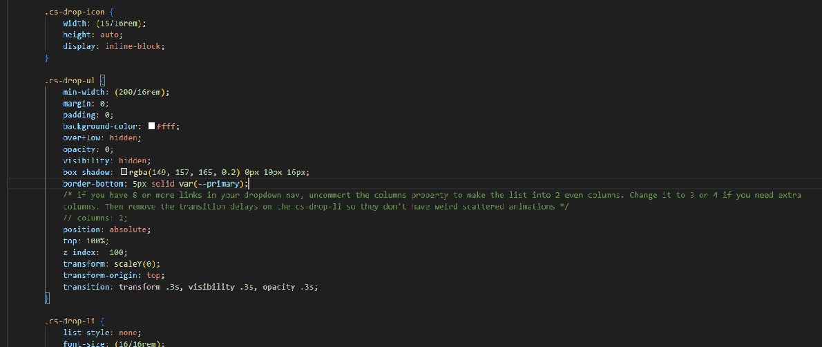
Long dropdown menus
If you have a long dropdown menu that looks too distracting on desktop, in the desktop CSS for the dropdowns, you'll find the .cs-drop-ul selector and inside of that there is a commented out "columns" property. We have a comment above it telling you what to do:
"if you have 8 or more links in your dropdown nav, uncomment the columns property to make the list into 2 even columns. Change it to 3 or 4 if you need extra columns. Then remove the transition delays on the cs-drop-li so they don't have weird scattered animations"
Simply uncomment out the columns to make it two columns and change the number to the number of columns you want to have.
However! This will make every dropdown have 2 columns. Maybe you don't want that. This is where you have to be a developer for a second and write some custom code!
In the cs-dropdown you want to have 2 columns, go to the class attribute and add a new class next to the cs-dropdown. For example, .cs-long or whatever you want. Then we go to the CSS and right under the .cs-dropdown in the desktop breakpoint we add the CSS for .cs-long to have columns: 2 on it. That's it. Now only the dropdowns with .cs-long on them will have 2 columns as their desktop dropdown style. Add that class to any dropdown you want to be 2 columns. Make a CSS rule for .cs-long3 to have them as 3 columns and add that class to any dropdown you want to have 3 columns.
Mega Menus
If you have a gigantic dropdown with like 16 links, it can look a little lopsided when they show up or can be cut off by the edge of the screen on the right. There's a very simple fix! Just add this code to that dropown, preferably on a separate class like cs-mega or whatever you want to name it:
This will center the dropdown with its parent nav link and help make the menu not so lopsided and creeping into the right side of the screen.
Code Stitch CSS Explained
Our CSS is written with our own custom naming conventions, done mobile first, and fully responsive. A lot of thought has gone into how to make it as easy to work with and edit as possible.
Our CSS naming conventions
There's many different CSS naming conventions out there, and there are developers who like certain ones over others. So we made our own naming convention that's based on some principles of BEM and others.
We don't use the BEM method because there's no way to predict all the different modifiers and names every developer would use. Part of the benefit of using BEM is to have a consistent naming convention that is utilized across the site. That won't be possible using CodeStitch. Also, the class naming system tends to be a little verbose and the double underscores are a turn off to a lot of people. So instead of using one method over the other, we made our own that makes sense for our Stitches and how they will be used to fit inside any possible project whether you use a naming system or framework.
How we use ID's
There's some who may say never to use ID's unless you need to target that element with javascript. We see it as a tool to use with much broader uses. Namely, we use them to scope all our Stitches CSS to that section and that section only. Our Stitches have to be placed inside other existing projects and not be interfered with by the code or interfere with the code themselves. Their code lives inside little mini ecosystems. The ID allows us to be very specific and say "THIS is the code for this section, leave it alone", so when you paste one of our Stitches in your existing projects they will work and not have to be fixed or refactored to play nice with your code base (at least 99%of the time).
Our Stitches also have a unique ID placed at the end of each one. This is to ensure no two Stitches will share the same ID so you don't have to worry about one Stitch overriding another. When we submit our code to the database, each Stitch has their own ID based on their section type and database position. So a services section will have #services ID on for that section. The system detects the ID, and replaces it with that ID + the number position in the database in both the HTMl, CSS, and javascript files we submit. On its way to the database, the system appends the unique number to the ID's on each file which ensures it will never override another #services section. So if you see an ID of #services-42, it means that it's a service card section and it was the 42nd Stitch added to the database.
We did this because otherwise, we'd have to keep track of all the ID's used or have a numbering system done manually which would be impossible to maintain as we scale. The ID's allow us to keep the CSS in every Stitch from interfering with each other when making websites with our code. Plus, the section's ID gets to be more semantic and meaningful as it also describes the section design it is. This is much easier to work with and edit as opposed to an ID with a random string of letters and numbers. That's just messy and you'll be looking back and forth many times trying to make sure you're working on the right CSS portion and remembering the random class names. This is a much more organized approach that also makes CodeStitch work.
We don't believe using ID's are poor practice, it's only poor practice when not used efficiently or properly. We use them for exactly the reason they were created - to scope our CSS and be more specific.
How we use classes
All our CSS selector names have a "cs-" before each class name to make sure none of our classes could overlap with any classes that is already in your project. Like this:
.cs-content: This div is the container for the topper, title, and text. It dictates the text alignment of them all and their position. The topper, title, and text are all identical on every single Stitch. The cs-content tells them how to arrange themselves for that particular Stitch.
We have a few universal classes used to designate our most common elements.
.cs-topper: This class refers to the colored text on top of the main h2's of each section.
.cs-title: Refers to the main h2 of a section.
.cs-text: Refers to the main paragraph text of a section directly under the h2.
.cs-button-solid: This is the CodeStitch default button style.
These are standard across every Stitch in our library to ensure stackability and a cohesive design. Imagine if every h2 or topper or text had different font sizes or margins and you try to build a whole website with CodeStitch. The sections won't match and you'll have to spend more time fixing them to all have consistent styles. By standardizing these styles across all Stitches, we can make sure you can make a whole website really quickly and every section fits in together and looks good together with minimal edits needed.
We're all about saving you time. It's impossible to have designs in our library that account for any possible fonts or colors or designs. So what we do is we provide a consistent product that's uniform and predictable to allow you to make it into what you need. We get you 95% of the way there, the other 5% is up to you and your design. We did the heavy lifting for you and all you have to do is tweak it.
For card sections:
.cs-card-group: Main container for a card group list. We also use this method for other groups like .cs-flex-group and other variations for a div specifically to create a flexbox between elements.
.cs-item: The individual item of the card group. We don't use .cs-card because sometimes they don't look like cards. This is a more consistent term to use since it's semantically a "list item".
.cs-icon: Used for the svg icons inside cards and other design elements.
.cs-h3: All non specific elements will have their element name prefixed by a "cs-". For example, if you have an actual list with text in your list items and not cards, then the <li> element will be called ".cs-li". Others include .cs-picture, .cs-link for a tags, .cs-ul, .cs-ol, .cs-h4, cs-img, etc.
.cs-item-text: This is reserved for the text content of a .cs-item card.
You'll notice how much cleaner the HTML is with much simpler and smaller class names as opposed to using BEM. Nothing against BEM, and it works great for a lot of developers. But for others it can be a little much. We went with a more simplified and descriptive approach that's easier to read and with less verbose class names. Since our ID is scoping the CSS to that section, we can reuse the same simplified class names across every Stitch with no need for modifiers or always coming up with unique class names. We only need to remember a handful of class names to reuse over and over again. This also makes edits a lot easier because you know exactly what classes you're looking for in any given section.
Our media queries
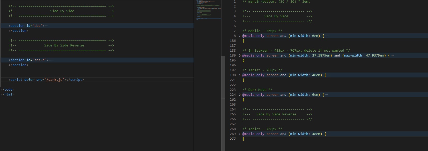
Much like how we view the ID's as a tool to use for scoping CSS, we use media queries as a tool as well to better organize our CSS. Here's an example of our base media queries:
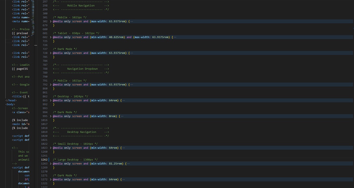
Why do we have a 0em media query for mobile? It's so we can group all the mobile first CSS and collapse it. It makes editing and navigating the CSS sheet so much faster and easier rather than having to scroll up and down a large CSS sheet scrolling over CSS we don't want to see in that moment. Here's what a whole stylesheet can look like with all the media queries collapsed:
We have comment tags at the top of each section's CSS so we know which section it belongs to and helps break up the different media query groups for better organization. This is how we are able to give you little CSS "components". We pack all the media queries for each section together, one on top of the other starting with mobile at the top.
While it doesn't make sense to use a 0em media query when you can write the same code without it and nothing would change, the only difference is the code will be in your face making you have to scroll past it every time when looking for the section you really want to work on. By using a 0em media query, we can organize our CSS better and make edits in a fraction of the time. It may seem unorthodox, and it was for me in the beginning when I first tried this method, but once you start to use it you will see the utility of taking advantage of the collapsing property of the media query to group and hide your code until you want to look at it.
We also do this for the dark mode CSS. When you select dark mode CSS in CodeStitch, everything is the same except there's a 0em dark mode media query at the bottom that has all the dark mode styles for that section. This allows us to be able to give you these options without altering the base code and keeping everything collapsed and organized.
I used to put all my tablet code in one media query, and all my desktop code in one media query with my mobile CSS at the top of the sheet floating around without a media query. Whenever I wanted to grab the code and move that section to another page or reuse that code in another project, it was a pain having to go up and down the document 3 times to grab all the code individually, then go to the new project and find each media query and plop the CSS one by one in each media query while also trying to make sure it's also in the right order. It was very cumbersome when it didn't have to be. It made the idea of having ready made HTML and CSS code blocks seem impossible.
But then I was introduced to the idea of writing individual media queries for each section and grouping them together. I thought it was inefficient and a little much, but once I gave it a try it felt amazing. Now I can move individual website code blocks from one project to another with ease in seconds and my code is much more maintainable and easier to edit. Give it a chance and I'm sure you will realize the benefits of it and start to love it the same way we do.
Using REM vs EM vs PX
This is a debate that can and will go on for ages. We sat and thought very diligently about what we wanted to use for our code to give to our customers. We came to the conclusion of using a hybrid model. Here's our guidelines for what we use and when:
- REM units: We use REM units for all elements - anchor tags, inputs, paragraph tags, header tags, list items, buttons, spans, etc. That way, if you need to change the font size, it doesn't affect the rest of the properties since the value of em is being calculated by the font size of the root element (html) and not on the font size of the element itself.
- EM units: We use EM for everything else or if we want that element to scale with the font size of its parent. An example would be an image group with multiple images arranged inside of a container in a unique way. We make a container around those images and use EM units for their height and width and positions, even the container. When we add a font size of 5px to the container, everything inside that container will shrink proportionally based on that smaller font size and fit on the mobile screen. This is called font-size scaling, and is a nifty tool to make unique design elements like that 100% responsive in one line of code. We also use ems for line heights and that's about it.
- PX units: We use pixels for borders and things we would not want to scale or need to. Mostly just borders because they can't handle fractional pixels very well and the border won't display properly if you try to scale it with font sizes or make its height in ems which almost always has fractional units.
That is our philosophy when it comes to what to use and why. Right now we use REM and EM on all our Stitches.
Using clamp()
The main way we make sure everything is in one spot is by using the clamp() property. Clamp() is a powerful and amazing CSS tool that allows us to set a minimum value, a growth rate that is tied to the viewport width, and a maximum value to stop growing at. It looks like this:
This means that the minimum value should be 2rem (32px on mobile) and grow at a rate of 5 times the viewport width, and stop growing once the value reaches 4rem (64px, on tablet or desktop). So if the value of 5vw is less than 2rem (32px), nothing changes and the minimum stays. Once the viewport width grows to a certain value that exceeds 2rem (32px) then that value will now grow with every pixel wide the viewport grows by and stops once it reaches 4rem (64px). The higher the vw unit, the faster it scales to reach the maximum. The lower the number, the slower it grows by. You can adjust this to make the values hit their maximum at whatever screen size you want. Just change the growth rate until the max is reached at that screen size.
By using clamp(), we can set all our margins, paddings, fonts, and any other values for mobile and desktop in one line of code in one spot, rather than having to change those values in separate media queries. This allows us to keep our CSS code to an absolute minimum, have all styles and sizes in one spot instead of two or three, and make our sites truly and 100% responsive. It is also supported by all browsers except for...Internet Explorer (Rest in peace).
For example, all the padding top and bottom of each Stitch is the same. Here's the clamp() we use to make mobile and tablet have 60px top and bottom, 1024px to have 80px, and then full desktop after 1300px to have 100px top and bottom:
The second value "1rem" is for padding left and right. You can see the convenience of using clamp() here. Instead of having to make a separate media query at 1024px and 1300px to change the padding top and bottom, it's all done in one line of code in the mobile code. If you want to change it, just make the rem values smaller or bigger to your liking. We include little comment tags above them to make it easier to see at a glance what their values are in pixels.
What is font-size: min(1.4vw, 1em); ?
This is a neat little font scaling trick we use to scale down entire containers and tie its font size to the view width (vw) units, and as the view width gets bigger the font size grows bigger and bigger and 1.4 times the view width. This is all set in a min/max function in CSS with the value of 1em being the max. If the inherited font size from the root element is 16px, then 16px is the value of 1em. If the font size minimum is 1.4 times the width of the screen, let's say at 500px wide that value comes out to .5em, or 8px. It's less than 16px so it will continue to grow until the value of 1.4 times the width exceeds 16px.
The lower the vw unit, the smaller the container will get and vice versa. This video will demonstrate it with examples to show the font size changing and stopping at 1em:
(Insert Video)
Using SCSS and LESS
We offer 3 types of CSS for you to choose from: vanilla CSS, SCSS, or LESS. SCSS and LESS are very similar but handle calculations a little differently.
At CodeStitch we prefer to use LESS because when we want to write out a calculation for em values, we just have to write:
The code will compile the calculation for me in rems as 1rem in the compiled css file. This makes working in EMs and REMs much easier and I don't need to use the font size 62.5% method to make the root font size 10px, which makes calculations easier. Here's an example of some LESS from a Stitch in our library:
The max-width is 700px and the margin-bottom is 16px. This is a much easier way to read and write your units by utilizing the calculation functions built into LESS. We don't need to make the calculations ourselves and we don't need to use font size hacks on the HTMl element. We can easily make edits and change the values anytime we want to anything we want and we let LESS and SCSS do the calculations for us. This makes edits MUCH easier.
In SCSS, this same calculation happens in a few extra steps:
So for this reason, we prefer to use LESS and still get to enjoy all the same features as SCSS, but with less upfront work doing our EM calcualtions.
We don't use SCSS variables or any more complicated functions in both LESS and SCSS because we want our code to be accessible to developers of all skill levels, and sometimes those more advanced functions can be quite daunting to try to read and understand if you are not a pro with it. For this reason, we decided to keep it simple and let the user make their own should they choose to do it. It's still far less work than creating the Stitch yourself, but this is a trade-off we had to make to ensure everyone could use CodeStitch and enjoy its benefits to build their business and make beautiful websites faster.
Side by side pairs
We consider a side by side Stitch to be one that has an image left or right of some content. We have different terms to refer to them for better organization and identification:
- Standard: We designate the standard to be image left, and content to the right.
- Reverse: A reverse has the content on the left and the image on the right.
- Reverse Pair: This is a Stitch with both the standard and reverse Stitch together in one with the standard on top.
- Reverse Triplet: This is a Stitch with a standard, then a reverse, and then the standard again all on top of each other.
We offer reverse pairs and triplet's because otherwise you'd have to copy and paste two or three Stitches to accomplish this and have a ton of extra code you don't need. Instead, we have a condensed CSS group in which both the standard and the reverse share the same base code, and only a separate reverse CSS block is made to reverse its arrangement on tablet. Below is the code for a side by side reverse pair on CodeStitch:
We do the same for the reverse triplet and instead of having three complete Stitch CSS blocks by grabbing them individually, we offer a condensed version that has all 2 or 3 stacked for you with the CSS cleaned up so it takes up significantly less space.
The code for a standard side by side is has an ID that starts with "sbs", the reverse block has a section ID of "RPsbsr", and the third triplet block has an ID of "RTsbst".
If its a reverse pair Stitch, then they have "RPsbs" as the base class name. If it's a reverse triplet, the IDs will all start with "RTsbs".
We then target all three of those ID's in the CSS:
We need to distinguish between reverse pairs (RP) and reverse triplet's (RT) because of the ID numbering system.
We COULD use a class that each section can share (which is recommended), but then our unique ID numbering system won't work and they won't receive their unique number that helps scope the CSS so it doesn't interact with other ID's of the same name. In order to allow our numbering system to work, we need to have the styles targeted with ID's.
If this is not ideal for you, you can easily change the selectors yourself to one class and add it to each HTML section. It's a little extra work, but still MUCH faster than actually building it yourself.
Our HTML
How we write our HTML
When we write our HTML, our goal is to use as few divs as possible and make the transition from mobile to desktop in as few steps as possible. It's a puzzle in which we decide how we want the puzzles to fit in the most efficient way possible. On every design we build, we plan out the HTML structure to be as simple as possible without any extra divs we don't need. In fact, some of our Stitches have no divs in them at all.
All of our sections have the same base HTML markup consisting of a comment tag, section container, and interior container. Like so:
Comment Tag
The comment tag helps label the section and make it easier to see where you are in the page and where certain sections are at a glance. It helps break up the individual sections on your document and makes it easier to read your HTML and know what section is doing what.
Section Container
We use the same name for the ID that we use for the comment tag, and will also be the same comment tag in the CSS file. This helps to find the CSS code faster and stay organized.
.cs-container
Using the section tag
We use the section tag to semantically separate each section of a website. Our goal is to use as few divs as possible. So instead of making the section container a Div, we use a section tag which also tells Google that everything inside of this tag is related to the topic of the heading we have inside of it.
You only use a section tag when your section has a heading h1-h6 inside of it. You cannot use a section tag if there are no headings inside of it, like galleries or full width image blocks. So if there are no heading tags in your section, do NOT use the section tag. Use a div instead.
Inside the section tags we have a .cs-container div. There’s plenty of reasons NOT to have a container div for certain designs, but to ensure our code is built to be edited and changed as easily as possible, we always have a .cs-container div inside each section tag to act as a container for the content to arrange itself inside of. While it goes against our motto of as few divs as possible, by having a container div around all the content we can ensure that if you want to add something else to it, have a separate background color for the section and the content, etc then you can do so without having to create a container div yourself and rearranging the css.
It’s a structural thing we want every stitch to have so its behavior is consistent across every design we code. It helps make our code easier to troubleshoot, edit, and be predictable in how it works and where to make changes.
We also have the .cs-content block which contains the main content of the section (topper, title, text, button)
Again, there's plenty of situations where we don't actually need the .cs-content div around them, but by doing so we can make edits and flexbox arrangement easier. This also allows us to keep our code consistent with less mess you have to override when making edits.
Background images
We insert background images in the HTML of every stitch inside of a picture element at the bottom of every section tag container, outside the .cs-container. Like this:
there's a few benefits to adding a background image inside the HTML as opposed to adding it in the CSS file as a background image.
- Take advantage of lazy loading without needing an external library.
- We can also add the decoding="async" attribute to the img tag which improves load times.
- It's easier to swap out mobile and desktop images in one spot rather than over multiple media queries in the CSS file.
- More control over which screen sizes the different images are loaded for. No extra media queries needed, set it in the HTML and change it anytime.
To better understand how we make the images behave like a background image in HTML, check out the Using the picture element section where it dives into the CSS that makes that possible.
Why we use lists for card sections
It's been very common to just use divs to make a card container and a card inside that and not even think about it. But using lists to make card sections has unseen benefits versus using divs for them.
- It's more accessible.
- Has more semantic meaning than just using a div
- Less div soup!
For accessibility, a screen reader will pick up on the list format and can take advantage of some of the accessible properties that come with them. When a screen reader goes over a list of cards, it will read it as "list, item one of 6...", read the contents of the list item (card) and then repeat the process until it makes it through the list. This helps the reader know what is coming and better understand the content they are being read. At CodeStitch, we are focused on making our code as accessible as possible with all the latest techniques. This is a new one we came across and have made sure it is implemented in every stitch as it is now considered a better more accessible option compared to using divs. The only thing we need to do is remove padding and margin from the ul and the list style from the li element. A minor inconvenience for more convenience to our visitors.
Code Stitch Forms
there's also another interesting accessibility trick we learned in our research, and that's using the label tag as a container. Every form in CodeStitch has labels for every input. This is another crucial accessibility measure because when you click on an input, the placeholder disappears and now you don't know what the input is for. By having a label, even when the placeholder text disappears you will still know what that input is for.
Labels typically need a [for=""] attribute which designates the ID of the input it is labeling.
<label for="name">Name</label>
<input type="text" id="name" name="name" placeholder="Name">
This is how it's most commonly done. However, what if you have a design with inputs next to each other, how do you keep the inputs and labels together? Normally, you'd wrap them in a div to keep them together when arranging the form elements, but instead of doing that you can just wrap everything inside the label tag and remove the [for=""] attribute altogether as seen in the example below.
<!-- ============================================ -->
<!--                     CTA                      -->
<!-- ============================================ -->

<form id="cs-form" name="Contact Form" method="post">
    <label>
        Name
        <input type="text" id="name" name="name" placeholder="Name">
    </label>
</form>
Now we can use flexbox on the form element to arrange the inputs and labels however we want without needing to add extra and unnecessary markup to do the same thing. Our forms are now cleaner, more organized, and easier to read and understand. It's still accessible and will function normally in a screen reader.
Button Tag vs. Input tag for submitting forms
We also use button tags as our submit element rather than an input tag with a [type="submit]. They are technically interchangeable, but the button tag provides more benefits such as:
- Input tags look like its editable or something that can take data like the other inputs. A button tag is much easier to see and recognize within the form.
- You can include other elements inside the button tag, like images, icons, etc. You can't add those to an input tag.
- The button tag can support pseudo elements, the input tag cannot.
- The button tag is more semantic as its name better describes its purpose.
Our Design System
There's a reason all of our Stitches have a similar look - it's by design. CodeStitch is not only able to be used to add a quick Stitch to a finished site, but it can also be used to build an entire website and every Stitch will blend together and look like they're supposed to be in the same website because they have the same base design system, spacing rules, text colors, and fonts.
If every Stitch had its own spacing between elements, different fonts, text colors, container sizes, etc, then it would actually be more work to build a full website with CodeStitch because you would have to go into every Stitch and reset their styles to conform to one consistent style across the site. It defeats the purpose and convenience of CodeStitch and limits our usefulness to only being a quick fix, and not something you can build a whole website with and save dozens of hours of work on every project.
By making all our Stitches have uniform design rules, it allows you to build entire websites in a fraction of the time without them looking like a mess.
The 4pt design system
Our 4pt design system is the core of our work. All spaces between elements inside and around it will be values that are a multiple of 4. You won't see a margin spacing with a value of 23px, or 103px. These random values make designs feel disjointed and not very tight. It feels off, you can't quite put your finger on it, but you know something is off. This is the uncanny valley of web design. Sure it looks like a website, but something is keeping it from looking like a 100% professional site and you don't know why - it's your spacing.
Proper and planned spacing that obey certain rules is what helps make a design feel more complete. And when you have many different designs you're trying to stitch together into one site, having them all obey the same rules like this will make them feel like they fit together and belong there. You will most likely have to change a few things, like removing border radius from some stitches because your design is not one that has rounded edges or changing a container size or swapping fonts. Little things like that to make each Stitch blend together more seamlessly will help make a website built entirely of Stitches feel like it was all designed together.
Spacing top & bottom
Spacing between the top and bottom of each stitch is just as important as the spacing between its elements. All of our Stitches have the same padding top and bottom for every screen size so when you stack a few Stitches on top of each other, they all have the same consistent and even spacing.
We've seen way too many websites that have very inconsistent spacing between the content and their containers and it just looks messy and slapped together. One of the biggest mistakes we see is not having enough space, which makes your design feel crowded. So we spent a long time playing with different spacing between the tops and bottoms of sections to see what looks the best at each screen size. Here's what we found and use for every Stitch in our library:
- Mobile (360px): 60px padding top and bottom
- Tablet (768px): 60px padding top and bottom
- Small Desktop (1024px): 80px padding top and bottom
- Desktop (1300px+): 100px padding top and bottom
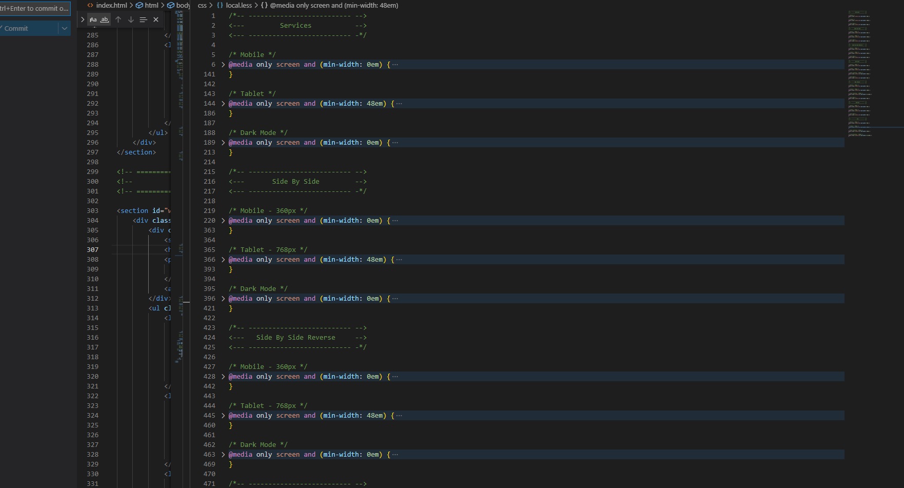
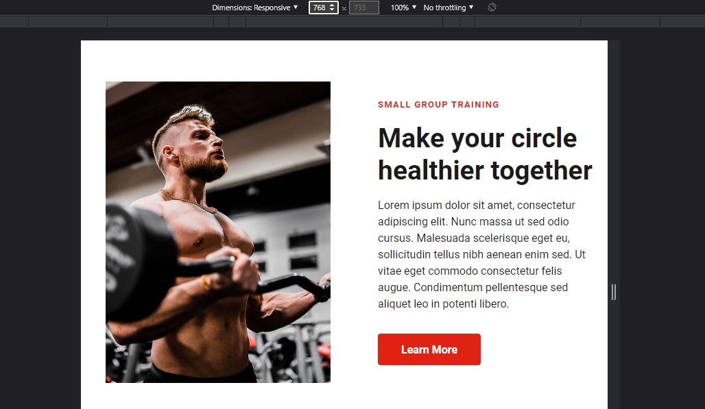
Below is an example of the desktop (1024px) spacing top and bottom on this side by side section from our library showing the spacing:
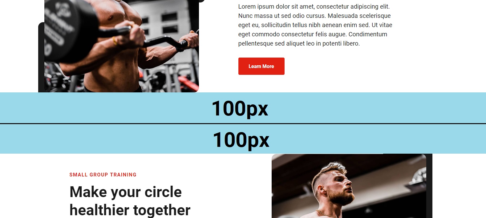
Every Stitch will have 100px padding top and bottom on desktop (1024px) so when you stack them, they all fit nicely and you don't need to worry about that part of the design when making a whole website out of Stitches. You don't have to think about it because we already did for you. Proper and consistent spacing is key to having a uniform design that feels cohesive and consistent.
Content templates
You'll notice that all of our content blocks for CodeStitch are the same (the main h2, text, buttons, etc) and this is not us being lazy, it's by design!
In order for our Stitches to be stackable and allow you to make a whole website with them, we have to maintain a level of consistency in the designs so you don't have to do as much edits after you paste them all in your site.
We made the decision early on that every Stitch should be able to be placed on top of another Stitch and look like they could go together with as few tweaks as possible. We'd like for people to be able to use our service to make entire websites, because if every section had a different font size or container size it would just be chaos when trying to stitch together a whole website and you'll spend more time going into every Stitch to make them each have a uniform design with the rest. This is why all our content sections have the same colors, fonts, font sizes, buttons, and margins. We're not trying to make every possible design for you, our goal is to provide you with designs that are close enough and only needing quick and easy tweaks to adapt to the design you want.
Stitch variations
This is another thing you'll notice in CodeStitch that might seem low effort in order to pad our library numbers when in fact it is serving a very specific purpose.
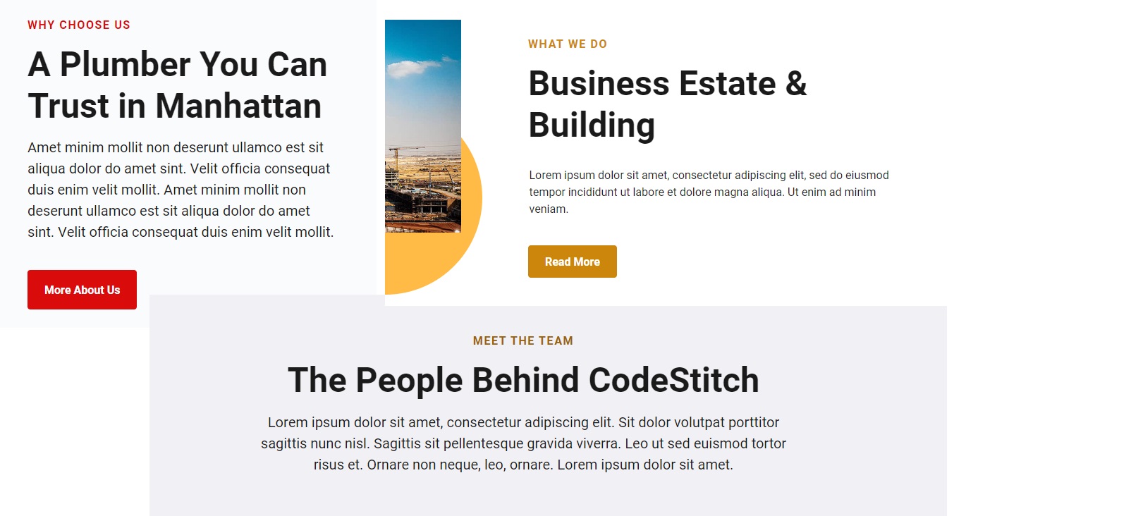
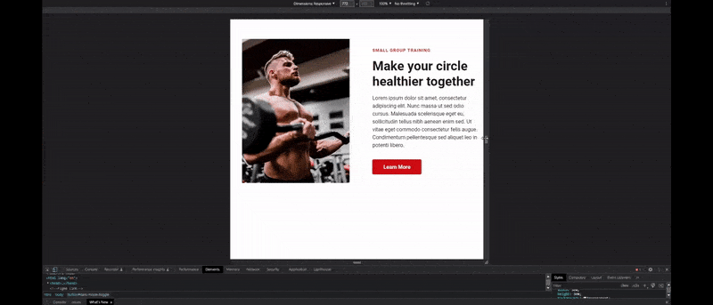
Below we have a standard side by side with its variation on the right:
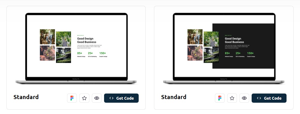
It's a very subtle difference between the designs. We make these variations because we understand that developers are not designers - we don't know what is possible or what can be done to a design to change it up a bit. We instruct our designers to come up with a couple variations of each Stitch design they do so you have as many options as possible. Maybe you've used a particular Stitch a few times and you'd like to have a little more variety with it. We add these variations so you are not stuck having to use the same designs over and over again. We can make the slight changes to them and give it a whole new look and feel which can be used in different types of designs that the standard one didn't fit well before.
We are also doing the extra work for you by making these variations. Now, you don't have to try and come up with different ways to present a design or have to edit the code to make those changes. It's more work we are doing for you so you can focus on the bigger picture stuff. It's all about adding variety and possibilities.
For service cards, the most common variation is adding cards. Let's say we have a 3 card section, but you need it to be a 4 card section. Every 3 card Stitch we have in our library will have a 4 card variation as well that's already built for you. The biggest difference is mainly in how these Stitches are done between tablet and mobile. Sometimes a 3 card design can fit 3 in a row, and sometimes we need to be more creative with their arrangement and how they stack. Contrast this with a 4 card design where we'd make it a 2 by 2 stack of cards on tablet and then on desktop we move them to side by side in a row. Handling a 3 card layout vs a 4 card layout presents different design challenges in terms of responsiveness and how they fit on the smaller screens. For this reason, we make separate 3 card and 4 card designs of the same Stitch to make sure every design is built specifically for the content it has.
When it comes to side by side Stitches we often get the most variations because right away with a standard design you get the reverse, reverse pair, and reverse triplet. That's 4 Stitches with one design. And when we make a subtle variation to that main design, we get another 4 Stitches from the variation, variation reverse, reverse pair, and triplet. Now, from two designs we have 8 total Stitches. We make the reverse pairs and triplet's for you to (again) do that work for you and refactor the code to be smaller than copy and pasting 3 Stitches on top of each other. We are anticipating your needs, and we know that content like this also tends to come in these pairs. So we provide it to you to easily access and drop into your projects with minimal effort.
So while variations can help us add more Stitches to the platform in less time, it also gives you a wider variety of designs to choose from and keep things fresh with less pressure to do any design yourself.
Container sizes
Containers are another tricky topic when it came to creating our design guides for our Stitches. Everyone can have containers of any size, so what should we use to be as flexible and cover as many bases as possible?
We did extensive research into common container sizes across a variety of websites big and small. Ultimately, we concluded that a 1280px wide container is the most optimal and is what comprises the majority of our container sizes. But that doesn't mean it's the only size we can use. There are certain sections we've noticed that can be more fluid and it doesn't actually hurt the design. Footers, navigations, service cards, banners, etc can be bigger while most of the website is in 1280px.
For example, a 3 card section might only need 1080px - 1280px to fit their cards and content. But a 4th card can push it to 1440px, which is our maximum container size. Same goes for footers. We've seen large companies utilize a 1280px wide container for the majority of their content and have a 1440px wide footer with 5 columns and a lot of info.
It's not 2003 anymore, we can have fluid container design. It doesn't all have to fit inside one main container size to rule them all. Design is much more dynamic now and we can get away with having some sections larger than others as long as it makes sense visually for them to be bigger.
For this reason, you'll notice our container max-width sizes will vary between 1080px - 1440px, with 1280px being the most common. The rest are dependent on how much content they have.
Adding Dark Mode
Adding dark mode is a pretty straightforward. It works by adding an event listener to the toggle, and when it’s clicked it adds a .dark-mode class to the body. Then, all the styles that are dependent on that class being on the body will override the default styles of that section. Those styles only run when the .dark-mode class is on the body. When you remove it from the body those styles' selectors aren’t valid anymore and don’t run. Every stitch in our library has a dark mode CSS block in a separate media query at the bottom that has the styles for dark mode already done for you.
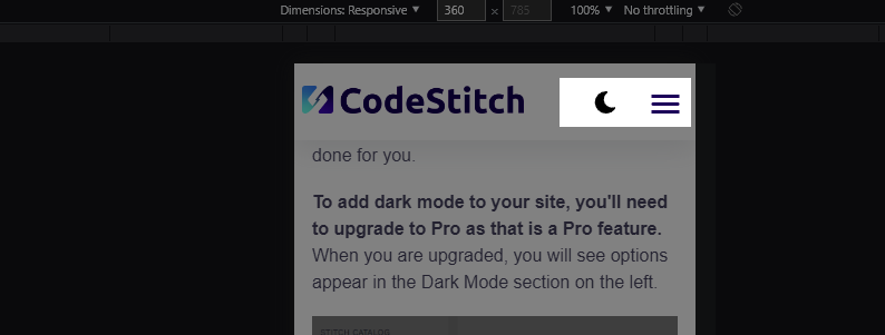
To add dark mode to your site, you'll need to upgrade to Pro as that is a Pro feature. When you are upgraded, you will see options appear in the Dark Mode section on the left.
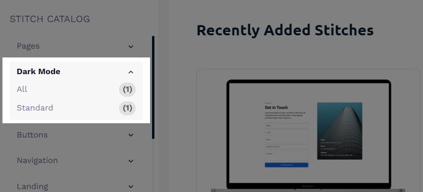
Click on "All" or "Standard" and it will open the same window with the dark mode Stitch ready to go. Click the "Get Code" button to get the code for dark mode.
There will be HTML for the toggle button, CSS to make the toggle work and includes our variables for base dark mode colors and style rules, and then the javascript that makes it work.
However, we also anticipated adding dark mode to our CodeStitch navigations. Not every navigation will be easy to figure out where to put the toggle. So if you use a CodeStitch navigation, you'll notice at the very bottom there's a button that's commented out. Uncomment that button, paste in the dark mode javascript and css, and it will just work! We positioned the dark mode button for you inside that navigation so you don't have to figure out how to place it. When you grab the navigation code and activate the dark mode styles button, it will also come with the toggle positioning and styles. You can then go into the base dark mode CSS you copied alongside the javascript and remove the toggle styling and positioning since you already have it as part of your navigation's CSS. We include it in case you're using the dark mode toggle and functionality in a site that is NOT using a CodeStitch navigation.
Where do I put the dark mode toggle button if I'm using my own navigation?
On mobile, the dark mode toggle CSS is absolutely positioned to be in the top right corner with space for a mobile hamburger menu to the right of it. If you want to have it on the left, remove the right: 3.75em; and add a left value of either 0 or however much you need to push it away from the left.
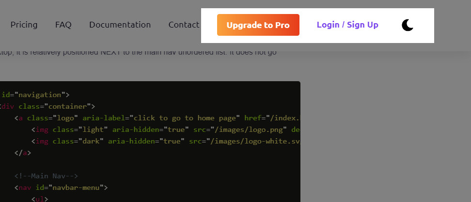
On desktop, it is relatively positioned to be NEXT to the main nav unordered list. It does not go inside the main nav with the other links. Here is example code from the CodeStitch website of where to place the toggle:
It should go at the bottom of the parent container for your main navigation UL. When you do this, the relative position let's it sit right next to the end of your navigation list in its natural order in the DOM. No special positioning is required. Here's how it is positioned on the CodeStitch website:
Where to place the Dark Mode CSS and Javascript
When you want to add the dark mode functionality to your website, all you have to do is copy and paste the dark mode CSS into its own file called dark.css, then link it at the bottom of the rest of your stylesheets for the page in your head tag. Then do the same for the Javascript and add it to its own dark.js file and link it at the bottom of the body tag with the rest of your javascript on every page. That's it. No need to npm install anything or add dependencies. It's all supposed to be straightforward and easy with no hassle.
How do I get dark mode Stitches?
It's easy to get a dark mode version of a Stitch:
- Click on the "Get Code" button of a Stitch to open the code box.
- In the top right you will see a "+ Dark Mode" button. Click this button to add dark mode to your Stitches
- All CSS options will now change to include dark mode styles at the bottom of the CSS code.
- Copy and paste the code and it will have dark mode styles included! No extra work.
Just make sure you follow the steps on adding the dark mode functionality to your website for the styles to work.
How To Change Images
This was a tricky situation to solve, we needed to provide images in our designs but if a user tried to swap in their own they would have to make exact crops for all the images. This is not very ideal and makes more work for the user. So we found a unique solution that allows users to swap in any pictures they want and the design is unaffected no matter what their dimensions are.
Using the picture element
The picture element is another tool we use to create image blocks. It is another semantic HTML tag that designates its content as an image and is more descriptive as to what it is and contains. We happen to also use it as a container to be the backdrop for our image.
The picture element can have a source tag inside of it that can designate which images get loaded at which screen sizes. To make things easier and simpler, we only include two. The max-width source tag is our mobile sized image and the min-width 601px is for everything above that. You can add as many as you want to be as responsive as possible. This source tag is important for our page speed scores since it allows us to load in a much smaller mobile image to load on phones as opposed to the large full size desktop image.
We add all the attributes we normally use for images on the default img tag and add the fallback image in the src="" attribute. We put the regular desktop image there, and when it detects the browser is being loaded on mobile it will swap that image for the one in the max-width: 600px source tag.
What we do with the picture element is we set the height and width to be the dimensions of the image that we need to have portrayed. Here's the LESS code we wrote for one of our side by side Stitches:
Then we target the img tag inside of it and absolutely position it to be 100% the height and width of the picture element, and the object-fit: cover; property makes the image act as a background image on the picture element and stretches to "cover" the entire height and width of the picture element parent.
We used the aspect-ratio property to maintain that height and width ratio as it grows at 95% the width of its parent container, and the max-width stops it from getting any wider than 550px.
Here's what this code looks like on mobile:
When we set it up this way, we can load in any image we want and it doesn't have to be the exact same dimensions as the original image. If we dropped in a 576px by 345px image it will stretch to cover the height and width of the picture element and still look exactly the same with the same shape.
There's another great advantage of serving up our images this way: we can be more responsive. We can change the height and width of the picture element to respond to the space around it and the image will always adapt to the new height and width. For example, on tablet we don't have a lot of space to work with. It'd be better if we had a taller and thinner image on tablet and make it grow into a square on it's way to desktop, which looks like this:
We use clamp to set a range for the height and width to start at the dimensions we want for tablet and slowly grow into the final desktop proportions we want:
If you are wondering, flex:none prevents the flexbox from squishing the element. Normally, it'd try to shrink the elements so they fit inside the box. To override this, we set the flex:none property and basically tell flexbox to leave it alone and stay out of my business.
We have a few clamps in here as well. Let's look at the height and width first. On tablet the width starts at 328px wide and grows until it reaches 502px wide, while the height starts at 440px and ends once it reaches 520px. When you grow the screen size, the picture element grows with the screen size and morphs into its final desktop form.
We are also growing the margins of the picture element to push against the left side of the container and the right side of its sibling. On tablet we want there to be 60px to the right of the picture element, but on desktop we want that to be 128px. Instead of making another media query for desktop, we just make one clamp() which takes care of the transformation and we see it transition from 60px to 128px gradually. Here's the results:
This is the magic of clamp() in action. We also have clamps on the font size of the text which is why they grow as well. Clamp() creates truly responsive behavior that turns our elements into shapeshifters that grow with the screen size until they reach their matured sizes. It's really cool to see live.
This demonstration is why we set images as background images to the picture element. Otherwise, we'd have to have LOTS of source tags to load way too many different sized images. It's more work than it's worth. With this method, we can only use 2 images to cover all our needs and let the object-fit property take care of the rest while the picture element grows to its full size. And is actually great for you, because you don't have to make 5+ precise image crops to maintain. You can just add in any images you want without having to match the height and width of the originals. It makes working and making edits SO much easier and faster.
Cropping Images
If you want to take your page speed and load times seriously, you'll need to make proper crops of your images so you aren't loading anything extra you don't need to.
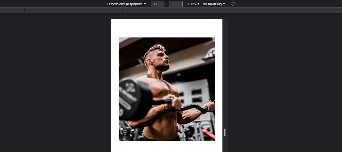
General rule is to make a crop of your image to be 2 times the display size of the image. This allows for optimal resolution at the smallest possible size it can be without looking grainy or pixelated. So let's look at an image on mobile:
On mobile at 360px wide, the image is about 312px wide and 335px tall rounded up. That means our mobile crop of the original image needs to be 624px wide, and 670px tall.
When we look at the desktop image, it's 502px wide and 520px tall, so we need to also make a crop of the original image that is 1004px wide, and 1040px tall.
How to make image crops
We use the GIMP open source image editor for all our work with images and graphics. You can download it here.
Follow the instructions in this video in which we show you how to use GIMP to easily make these exact crops that you need to make and be able to do them in seconds. It's not that bad actually.
(Insert Video Here)
Swapping images
Swapping in new images is actually really easy. We recommend naming your mobile image the same as your full size desktop image, except add a "-m" at the end of the name like we did here:
If you want to change the image, just change the file paths in the source tags. That's it!
Best practices
We have a very extensive write up on how to optimize your images you can check out for an in depth write up on everything you should be doing to get a 100 page speed score. For a quick checklist:
- Make approximate crops for your mobile and desktop.
- Convert your images to WEBP format.
- Then compress your images and save them to your images folder to replace all your old images.
- Lazy load all images below the fold with the loading="lazy" attribute.
- Add "decoding="async" to every single image tag on your site.
- Make sure all images have their height and width attributes properly filled in.
- Make sure you have your alt tags filled in.
Code Stitch Freelancer Account
By default all free and pro tier account have access to the "Private Library" section of CodeStitch where you can create your own personal component library of your own code that you can browse in a side navigation just like you do with CodeStitch - except you created the sections and categories. Free tier accounts can create up to 10 personal components, pro tier can create up to 25, and freelancer upgrades can create an unlimited number of personal Stitches.
The blue background signifies that it is in the active state, so in the picture above we can see that right now your Stitch library is the active library that we are viewing.
When you toggle between the libraries, the left navigation options change from the CodeStitch sections to the your Stitch sections that you created.
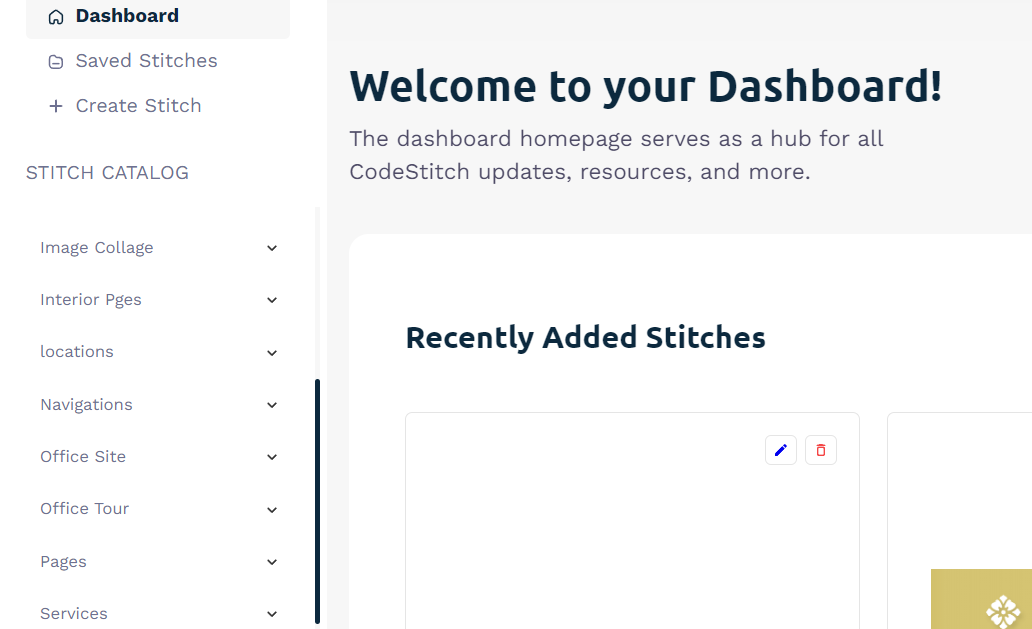
You'll notice the left navigation doesn't match the CodeStitch options. We created these under our own personal Freelancer account and these Stitches are only viewable to the account holder. No one can access them but you.
Uses for creating your own library
- Maybe you liked a certain Stitch we provide and you modified it and want to reuse it for other projects. You can just create a Stitch to your personal library to reuse over and over again.
- Or maybe you made a page you really like and want to be able to reuse that entire page. You can save all the code you need for that page into a Stitch for yourself. Then when you get the code, you copy and paste the code for the whole page and it's done!
- Or if you have your own designer you work with to make custom sites for your clients you can save your designs you coded for yourself to reuse over and over. It's a component library of your own creations.
- Or you have a day job building sites and you want to save your code to reuse and make work go by faster since you don't have to build everything from scratch.
- Maybe you prefer to use Tailwind or Bootstrap, but like our designs. So you take our figmas to make a website design and build it yourself in Tailwind or Bootstrap and save that code into your own library to use. Now you have your own component library of your own custom Tailwind components.
Creating your own Stitches
Once you have upgraded to a Freelancer account, you will see a "Create Stitch" option in the top left options menu. Click that to open the form to begin adding your Stitches.
Once open, you can begin adding your Stitch. The first thing you need to do is add a title for your Stitch, and select the section and category that it belongs to.
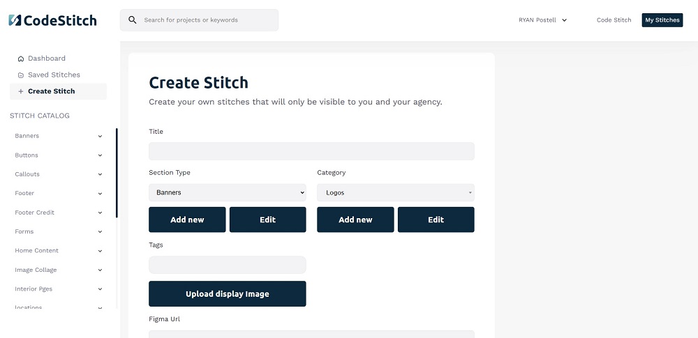
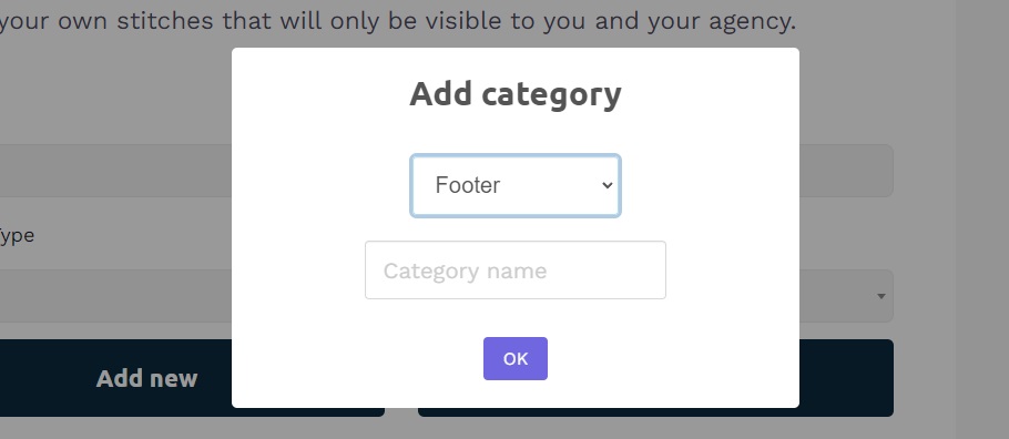
If you have no categories right now, or the category you need doesn't exist, you can add it by clicking the "Add new" button and a modal will pop up asking you for the name for the new section.
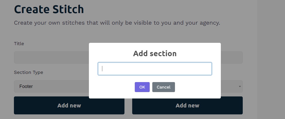
After you created the new section, you need to add a category. let's say you added a Footer section, look at the design and decide how it should be categorized. Some options can be Five Column, 4 Column, 3 Column, Embedded Maps, With Forms, etc. Whatever you feel like you need to best describe it and organize it to find it next time you need it.
When adding a new category, you need to select the Section that the new category should be attached to and then write in the name for the new category.
Next, you will be able to click the "Upload Display Image" button to add the display image of what the design looks like that the code creates. You can take a screenshot and save it as a jpg to your computer to upload. If you have a Windows system you can use the Snipping Tool to drag a box over the portion of the screen you want to capture and it will save it to your clipboard. Just hit the windows key + shift + S to open the snipping tool and drag the box over the portion of the screen you want to grab. I just have Microsoft Paint open so I can paste it in there and save as a JPG.
On mac, you can follow these steps to capture a portion of your screen. You hold shift + command + 4 to do the same action on Mac.
We also provide a URL for a Figma link if you use that service so you can add the link to the design if you need to.
If you make a mistake, you can select the section or category that needs to be changed and click the "Edit" button to change the section or category name.
You can also add any tags you want that is attached to this component so you can search your library much easier.
Adding your code for your Stitches
We provide input boxes for HTML, CSS, and Javascript. If you need other options to save, you can click the "Add Additional Code File" button to add a different code type like PHP, React, Tailwind, JSON, Vue, Angular, whatever you need.
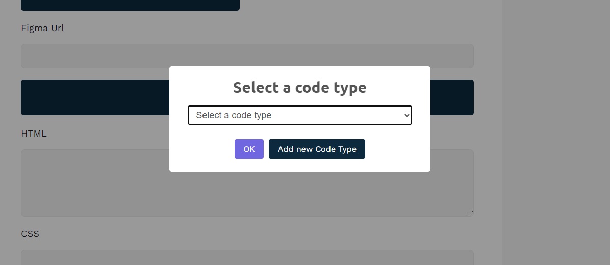
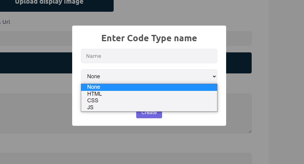
There won't be any other options by default, you create them as you need them. So if you need to create a new code type, click the "Add New Code Type" button. Type in the name and select the type of code it is.
Then all you have to do is copy and paste your code into the appropriate input fields and click the "Create Stitch" button to create it and save it to the database. That's it. After some time working with the process, it takes me about 30 seconds or less to add a new Stitch to my Agency account.
Editing your Stitches
Maybe you made a mistake when submitting your code or want to update it, click on the pencil icon in that Stitch's card to open up the Create a Stitch boxes again and edit the entire Stitch and save.
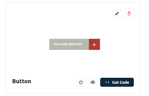
You can also delete a Stitch by clicking on the trash can and quickly remove that Stitch from your library.