
Step 1 - Optimizing Images
Using The Picture Element
Whenever you are serving images in your site, you should be using the picture element so you can choose which sized files you want to load on which sized screens. Here’s an example of how to use it:
I usually have just two sources: 1 for mobile and one for the rest. The first source tag has a max-width of 600px, so everything under 600px will load the ex-services1-m.webp')}} image and everything after 601px will load the normal sized ex-services1.webp')}} image. The image tag at the bottom is where you put all your lazy loading and height and width attributes and the fall back image in case some browsers (cough cough, safari….) don’t full support them.
So now, on mobile screens they will load the much smaller image which will drastically improve your page speed and load times. Now that we have our images set up properly in the HTML we can start making our crops of them.
Cropping Your Images to Display Size
When you are looking at your design mock-up on Figma or Adobe XD or even if it’s on a finished site, get the exact dimensions of the display size of the image. Like so:
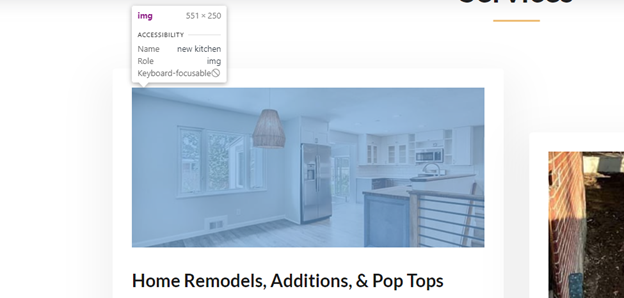
By hovering over the image in the site we can see it is displayed at 551px wide and 250px tall. So the optimal desktop size for this image would be 2 times the display size. This is the optimal display size to account for all possible screens and pixel densities. So this image should be cropped down to 1102px wide and 500px tall.
When we go to mobile and check the size there, we see that its dimensions are smaller:
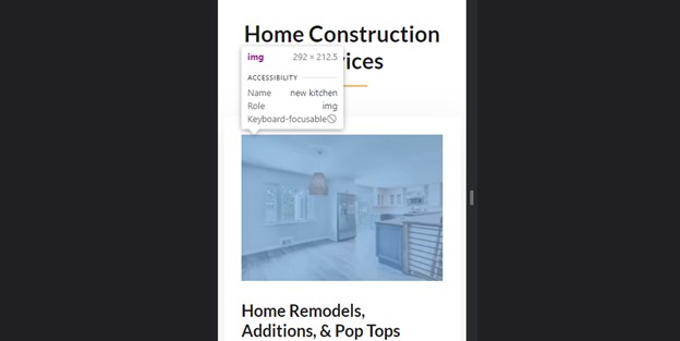
It’s 292px wide and 213px tall (rounded up). So we’d need to make a mobile crop of the image at 584px wide and 424px tall. Save this image with the same name but add a “-m” at the name. So if this image was called kitchen.jpg')}}', you’d have a kitchen-m.jpg')}}' for the mobile image. It’s best if you do these crops as you build the site and save the photos that way it doesn’t feel like such a chore at the end of the build.
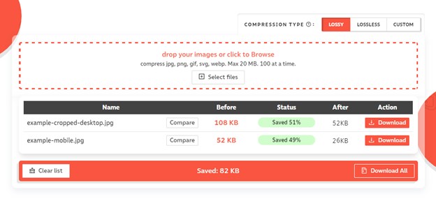
Originally, this image was 4760x3173 pixels, and was almost 1MB in size. All those pixels are not needed. When I cropped it to 1102x500, its file size dropped to 108KB, nearly a 90% reduction. On mobile when we made the smaller crop, it’s file size dropped to 52KB, a 50% reduction in file size from desktop. On mobile, loading a 52KB image is significantly better than loading a 1000KB (1MB) image.
Compressing Your Images
Now that we’ve created our crops, we have to compress them and covert to WEBP for the best performance. We highly recommend using compressor.io to bulk compress and download images in batches. After compressing our images, our 108KB desktop image dropped to 52KB, saving 51% of its space and mobile went from 52KB to 26KB, a savings of 49%.
Generally, between 20-40KB is about where you want to be for mobile images like the one we made here. Background images can be bigger, but they should never be over 100KB.
We went from a nearly 1000KB image to a 26KB image on mobile. This will take very little time to load compared to the original. You need to commit this process to memory and do this for every image on the site to get the most speed out of your site.
Converting your Images
Next, we convert that image to a WEBP image. We like to use cloudconvert.com but you can find the WEBP converter that works best for you. WEBP images are about 30% smaller than traditional JPG images and 26% smaller than PNG images, which roughly translates to about 25-35% faster load times. This compounds all the effort you put in before you converted it to WEBP. By making smaller image sizes, compressing them, and converting to WEBP, your images are as optimized as they can be and won’t cause you any trouble come load time when the site gets called up by the user.
Lazy Loading!
Every image below the fold (below the bottom of the screen when your website loads) needs to be lazy loaded. They aren’t needed to load the landing section, so why should we waste the resources loading them all when they won’t even be seen when the site first loads? This is what lazy loading does. It doesn’t load the images until right before they’re about to pop up in the screen. NEVER lazy load images that are above the fold, this will cause CLS (Content Layout Shift) issues and lower your page speed scores.
Lazy loading is as easy as adding loading="lazy" to your image tag. That’s it! It utilizes the in browser tool to lazy load, you don’t need any libraries or complicated javascript. Also don’t forget to add your alt text and height and width attributes.
Image Decoding
Every single image tag on your site needs to have the decoding="async" attribute on it. By default the browser is loading text and images at the same time. By adding decoding="async", we are telling the browser that the decoding for the image can be done later so the other content can be displayed. This is preferred for performance. This is something I was never taught when learning web dev, and it’s a very useful attribute to squeeze as much as you can out of your load time.
Optimizing The Landing Page Image
One thing I do to minimize the load times on mobile is I will take the normal desktop image and crop out the center of the image like 800px wide like this:
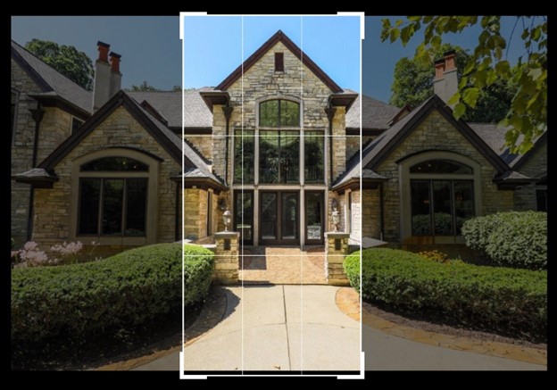
The mobile screen will just cut off the left and right portions of this image anyway, why should we have to load it all? So I make a special Crop of the center of the image to use for mobile screens and load the full sized image on desktop. This neat little trick saves you a lot of space and helps load faster without having to stretch an image to fit it. I make sure to do this for the landing page because it can’t lazy load so I make it as small as possible by cropping it to be the same width as a phone screen with no waste. But you can do this for all background images that need to be tall and thin on mobile. Don’t load the whole image and let the browser crop it, crop it yourself and save that extra space.
Preloading Critical Images
This is something I never knew about until recently, but you can use the preload tag to preload your critical images. You place this in the <head> of your document.
<link rel="preload" as="image" href="landing-m.webp')}}">
What it does is it tells the browser about the resources you want to load that are critical to the page loading before the HTML can be read. I like to use a tag for every image that needs to load on the landing page above the fold. So you can even add one for your logo. You can also preload your fonts, but we will go over that in the fonts section.
Lazy Load Background Images
This is another crucial step in getting closer to that perfect 100 score. There’s plenty of libraries to lazy load images that are called as a background image in CSS, but you don’t need to use any of them. We are going to do this with our picture element.
Place your picture element at the bottom of the main container that will have the background image on it. Like so:
The #cta section tag is the main container of this section and will have the background image on it. Set that container to position:relative and z-index: 1. You can also add a class to your picture element, I chose to target it by the element itself in this case. What’s great about this method, is we can also add the lazy loading and decoding attributes to the img tag, which we couldn’t do if we were loading this image in CSS. And we can serve up a mobile size and desktop size image.
Here’s the code for the picture element and the img tag inside of it:
What’s happening is we are setting the picture element to be 100% height and width of the #cta container and setting it to position absolute so it can sit on top of it and a negative z index to place it behind the content. Then we set the image tag to the same properties to be 100% height and width but we add the object-fit: cover property. This makes it so the image stretches proportionally to fill the entire picture element container from top to bottom. This now looks and behaves exactly like the background-image property in CSS, but it’s in HTML. Here’s the final result:

There is also an overly on top of the image to darken it, but this is how it works! By adding in our background images in HTML instead of CSS, we can now lazy load them and set their decoding to async. It also makes it easier when you have to swap images so you don’t have to run up and down the CSS sheet finding the mobile and desktop declarations for the background image and changing the file path. You just do it in one place in the HTML. So much easier, and much better performance.
By doing these image optimizations, you can skyrocket your page speed and load times well into the 90’s. But we’re not done there!
Step 2 – Optimizing your fonts
This is a huge pain point for a lot of people and one that took me along time and many tries to understand and get right. This is another topic that was never taught to me when I first started learning web dev as well, and I am going to show you everything you should know.
Don’t Use Google Fonts!
Hosting your fronts from the Google Fonts CDN link is out. It is not recommended anymore and if you care about page speed, there is a better way.
Save this link to your toolbar, Google Fonts Helper
This is the tool I use everyday to grab my fonts. It has all of the fonts Google has but it does one thing that they don’t do – they subset the fonts. Subsetting fonts means removing font characters that you won’t be using ever on the site. Many fonts come with over 200 characters and you’ll never need to use 95% of them. They include those special characters with tildes and dots above them and other weird non standard symbols. You only need the capital and lower case letters for the Latin alphabet, punctuation, and the numbers. At most you only need about 70 characters per font, but Google Fonts CDN loads them all. This is what the number 1 is referring to when we search and find a font we want to use:
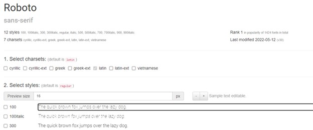
Latin is selected by default, and it removes all the others you don’t need. This can reduce the file size of each font from 180KB to 18KB. Huge savings.
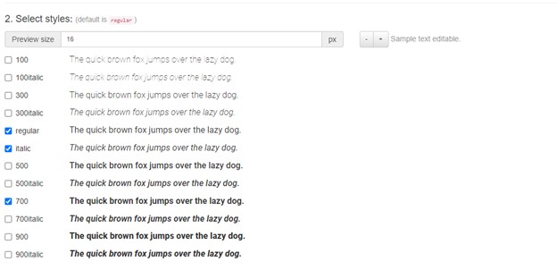
At the number 2, you select the font weights and styles you need for your site. For optimal performance, I always recommend choosing as few as you need. In my sites, I try to only use regular, 700 (bold), and italic. Sometimes I need 900 (black) but that’s usually as far as I will go. The more styles you use, the more you have to load, the slower your load time will be. If you KNOW you will not use any italics in your site and never in the future, then you can remove the italic style and lighten your load.
Once you’ve selected your fonts, number 3 gives you the CSS. Click the “Modern Browsers” button to get the modern code to do this. At the bottom you can even customize the file path to make all the font file paths match where they are in your folder structure.
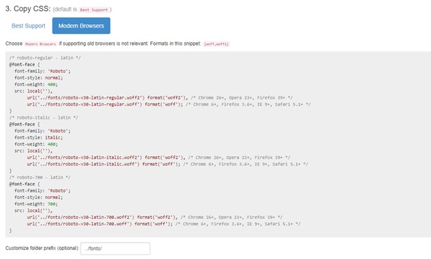
Copy and paste this code into your CSS stylesheet that will be shared on all pages of the site. I usually have a core-styles.css sheet that has all my nav and footer styles as well as button and font styles for the whole site. That’s where I put my font declarations, right at the top. You need to add font-display: swap; to each @font-face though. I put it under the font-weight property like so:
Now, at number 4, you download your fonts and place them in your /fonts folder. That’s it! Now you have just locally hosted your fonts and not only improved the security of your site, you increased its load time and never have to deal with that pesky render blocking warning for third party scripts again (at least for Google).
Preloading Your Fonts
It’s the exact same mechanism for preloading your landing page image and logo. Just copy and paste this under your preload for the image:
<link rel="preload" href="/fonts/roboto-v30-latin-regular.woff2 " as="font" type="font/woff2" crossorigin>
For the href source, you add the file path to your font file. If you only use one font style on the landing page above the fold, only load that one. Like if you have no bold or italic text on the landing section, only preload the regular 400 font style in the head. If you have both regular and bold, and two separate preload links in the head with each font file.
This will further reduce the load times of your fonts, which will reduce the load time of your site. When you’re sitting at a 98-99 page speed score, this is often that bump you need to get that 100.
Fixing Flash of Unstyled Content
Sometimes you’ll get a content layout shift of like .004s because of your landing page text. What’s happening is the browser loads its system default font first and then swaps it out for the @font-face fonts you’re loading in. How do we fix this?
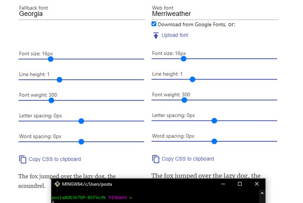
We set the fallback font in your font family declaration to a system default font that most closely matches its size and shape. We do that with a font style matcher that you can use here:
https://meowni.ca/font-style-matcher/Here’s a good list of browser default fonts to use. Scroll down to see what they all look like:
Font Style MatcherSo on the font style to be matched on the right side you upload the font you’re using on the home page from your /fonts folder and you’ll see at the bottom there will be text showing that font. On the left you type in the browser default font from the list I linked and find the one that most closely matches that size. If your text on the home page is 20px set both fonts to 20px with your slider. Then check to see that their line heights match up too. I use a small terminal widow or something and line up the bottom of the text lines to make sure they are perfect with the top edge of that terminal window.
That’s how I like things up. If they’re off by a pixel or two I change the line height of my websites text on the right to match the height of the browser default font on them left. Once I have it perfect, I change the line height of that text to match what I found in the font style matcher. If you keep seeing small CLS, change the line height very gradually. Like go from 1.49em to 1.51em and test it and see if the CLS goes down. If it goes up, lower it to 1.46em, then see if it gets better. Eventually you’ll get it to 0 with trial and error.
Sometimes you wind up with crazy big CLS (content layout shift) on your big main text and you don’t know why. I’ll tell you why: when the default system font loads, sometimes it can fit an extra word on a line, but when the new font loads, that word gets bumped down to the next line because the letter spacing between the letters of that new font are bigger than the system default font. When that extra word gets bumped down to the next line, it causes a very noticeable CLS. It happens so fast you might not see it when you load or refresh your page. To see if you’re having that issue, change your font for that heading to a the fallback font that you found closely matches. If you had Roboto for your font, Arial should be your fallback, so set the headings to Arial, then see how the text lines up on mobile compared to when you change it back to Roboto. You’ll notice the line jump then. I’ve spent days trying to figure out these large CLS shifts on my headings and I finally cracked it when I realized what was happening. It will take some time and practice and adjustment to get the CLS to 0.
So when you run into this, the fix is to make your font size smaller so that extra word fits in that line and won’t cause a shift by jumping to the next line when the new font loads. Now you know how to fix mysterious CLS shifts on your heading text. Page speed score continues to improve!
Everything Else
Google Analytics
Google Analytics is a render blocking script. Put it at the bottom of your <head> tag right above your <title> tag. It will allow everything above it to load before it tries to load. I’ve even heard of some people putting it with the script tags at the bottom of the <body> tag with the other scripts. But I don’t have the info on whether that’s bad or not. I put mine above the <title> tag and everything runs just fine and I don’t get that warning for third party scripts render blocking my page.
Minify CSS and JS
I use Netlify to host all my static sites and they have options in my build and deploy settings to Minify my css and js. But there are other options out there to do it. Just make sure you’re doing it. It will help reduce the size of those files. There are plenty of free CSS and javascript minifiers you can use online as well to do it manually.
Use SVG’s Wherever You Can
I use Flaticon to customize and download thousands of SVGs that I use for my projects. Best $10 a month I ever spend.
I serve them up in image tags so it cleans up the DOM and is easier to manage. So like your social media icons and phone and email icons, icon graphics for cards, etc. svg as much as you can.
Then I optimize all my svgs with this tool:
https://jakearchibald.github.io/svgomg/Yes you can even optimize svgs! Save as much space as you can.
Defer nonessential Javascript
If your js files don’t need to execute for the page to load properly then place them at the bottom of your body and add the defer attribute to them so they defer their loading till after the website has loaded and they don’t “render block” it and prevent the website from loading because they has to execute first.
Like This:
<script defer src="/nav.js"></script>
Remove jQuery and Other Third Party Scripts
If you can, remove any third party scripts you don’t really need like JQuery. JavaScript has come a long way and can do many of the things JQuery used to only do. I reworked my clients sites to not use JQuery anymore and it helps jump up your page speed and security. It’s time to start moving away from JQuery if you haven’t already.
Font Awesome is another third party script you really don’t need to be loading. If you need icons, just go to Flaticon and download an svg icon to use. It’s one less CDN link you need to load, and a boost in page speed.
Prevent CSS stylesheet from render blocking
Sometimes when you have a large CSS file, it can render block the page and throw up a warning in the Page Speed Insights test, resulting in a hit to your score. There’s a way around this: deferring the loading of you CSS sheet. But not the whole sheet. You take the CSS rules for only the section that is above the fold, and separate It into its own CSS file, I call my critical.css. This is the CSS that is critical to fully load the landing section. Then you add a little script inside the link for your main CSS sheet to defer loading it until the rest of the site has loaded. Here’s what it looks like to defer a CSS sheet:
But what happens when a user has javascript disabled on their browser? The CSS for the rest of the site won’t load because the javascript inside the link tag won’t run. The fix is to load the CSS sheet in a noscript tag like this:
This basically says “if javascript is disabled, load this stylesheet”. That’s our fix. When we put everything together it should look like this:
You have your critical.css sheet being loaded first, then your deferred stylesheet with the rest of the styles for the page, then your noscript tag for those who have javascript disabled. That’s it. Copy and paste this code and just change the file paths.
Often times I found myself with a strong 98-99/100 page speed score and was flustered at how I can squeeze another point or two. When I learned how to use critical CSS and defer the rest, it bumped me up to that 100 and removed the render blocking warning for my CSS sheet.