How It Works

The Secret is in the CSS

Get Started For Free

The Way We Code

Every Stitch has a unique ID when it gets submitted to the Stitch Library. The system then appends a unique number to that stitchs' ID and is used to scope the CSS for each Stitch so it doesn’t interfere with the other stitches of the same ID name, the rest of your project, or vice versa. This ensures its flexibility to be used in any project and play nice with the rest of your code. We also use our own simple class naming conventions to make the CSS easy to read and know what everything is doing with detailed documentation.

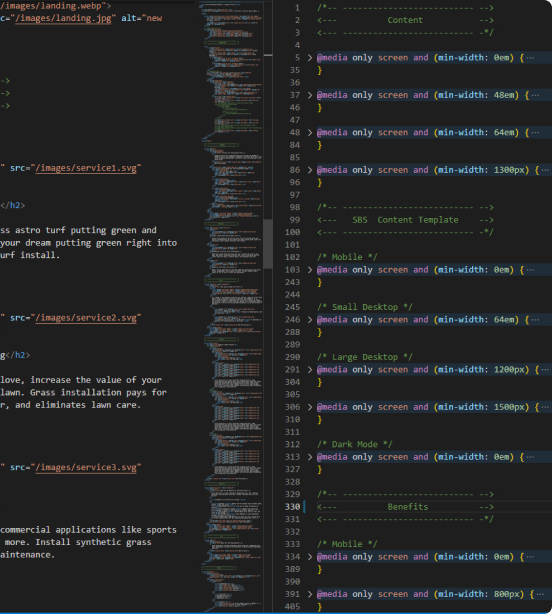
Organized and Ready to Edit

We group the media queries for each Stitch together starting from mobile at the top and desktop at the bottom. They are also each labeled by their screen size and device. We do this so all the code can be collapsible and stack on top of each other, which makes finding what you need faster and easier because you dont have to scroll up and down hundreds of lines of code. You just expand the media query you need in the section you need it. It's also the key to how our code is shared since it keeps all the CSS for a section together, making it easier to copy and paste wherever it is needed like a little CSS component without needing React or libraries.

No Line Wasted

Our HTML & CSS is written to be barebones, semantic, no frameworks, and having as few divs and media queries as possible with no wasted space. The cleaner the code, the easier it is read and navigate when you’re trying to make edits. There's no bloat or wasted space in our work.

Let's See a Demo

Magically Resizing Images

Images can be tough when designing Stitches for anyone to use. We needed a way for you to add your own images without worrying about making exact crops.

With the picture element, we can use the source tag to load mobile-sized crops on mobile and the full-size image on desktop — which significantly improves performance and load times.

Finally, we set the img tag inside the picture element to behave like a background image by using the object-fit: cover; property.

The object-fit property bascially makes the image tag act like a background image and will proprtionally stretch to "cover" the entire height and width of its parent. Just make a mobile-sized image and a desktop-sized one and load them in the source tags we provided and they will just work. No matter what dimensions the images are, they won't affect the design. For optimal load times, and if you have the time, it’s always recommended best practice to make exact crop measurements.

How To Optimize Your Images

To help you choose the crop size, take your image width displayed on mobile, double it, and you have your width. For example, if it’s displayed on mobile at 300px wide, resize your image to 600px for best resolution and size, then the desktop image can be 2X of its actual display size. There’s no reason to load a 2000px wide image on mobile when the screen is less than 400px wide on average.

CS Pro Tip

We HIGHLY encourage compressing your images and converting them to WEBP format. All our images will come compressed but not converted, since chances are you will be changing them anyway. We recommend compressor.io to bulk compress batch images and cloudconvert.com to convert to WEBP, but feel free to use any service you prefer.

Be sure to reference our page speed handbook to ensure you’re doing everything you can to get a 100 page speed score. Read The CS Page Speed Handbook

Ready to start creating beautiful websites?

Our blocks are designed by professional designers, and developed by skilled developers so you don’t have to worry about the details.

*No spam, we promise. Only product updates. Get Started